Climate stories

With, and around, data

JAMES GOLDIE

Data and Digital Storytelling Lead, 360info

Today

  1. Why should I tell stories?
  2. Prime considerations for comms
  3. Handling jargon in climate stories
  4. Conclusions

Slides

https://ssa2022.talks.jamesgoldie.dev

(Code for these slides is at https://github.com/jimjam-slam/talk-ssa-2022)

Hi!

A picture of me and my PhD supervisor, Lisa Alexander, at my graduation.

A picture of me and MCCCRH staff members on Zoom.

A picture of me and MCCCRH staff members on a work trip.

A picture of Graham Creed from the ABC presenting climate projections.

A picture of Jane Bunn presenting statistics on shrinking winters.

I used to be a climate + health researcher

Worked with CLEX and MCCCRH on climate change communication

Now I’m a data journalist with

360info is an open access global information agency that tackles the world’s biggest challenges and offers practical solutions.

Open data @ github.com/360-info

Why should I tell stories?

Scientists are trusted

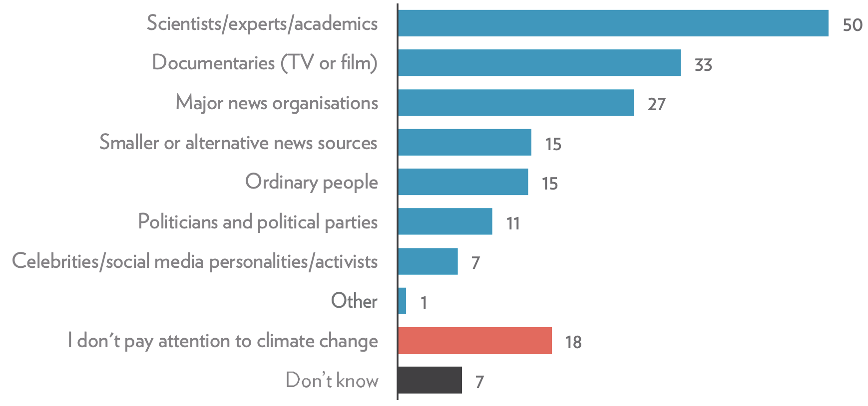
Sources of climate change news you trust (n = 2038)

Barchart showing various sources of information on the Y-axis and the fraction of surveyed people who trust them to deliver climate change information on the X-axis.

Park et al. (2022, p. 18)

The chart challenge

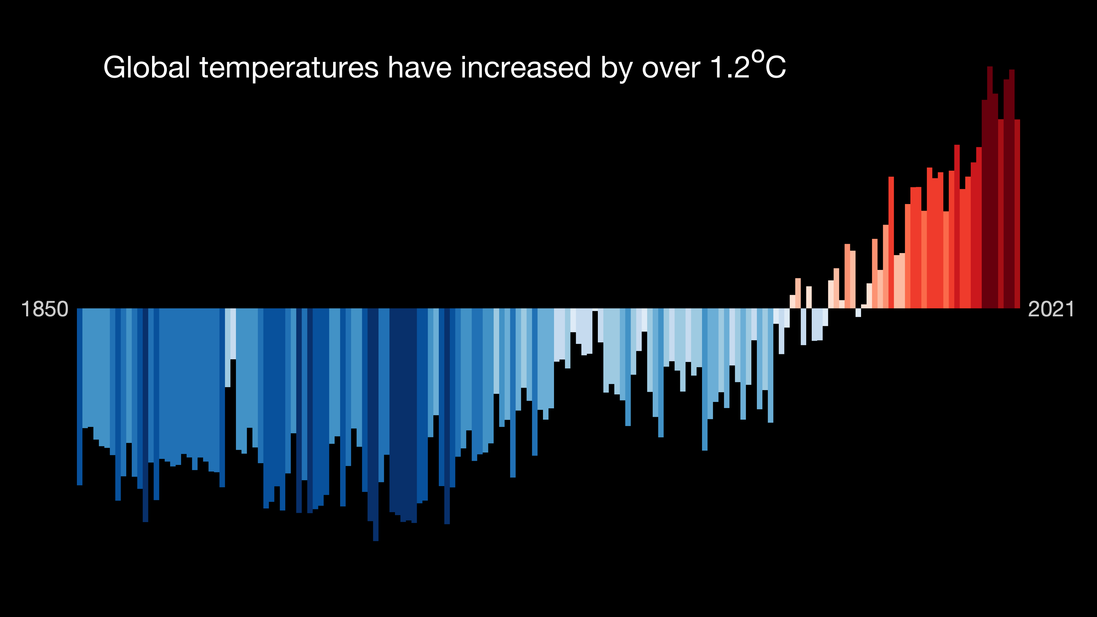
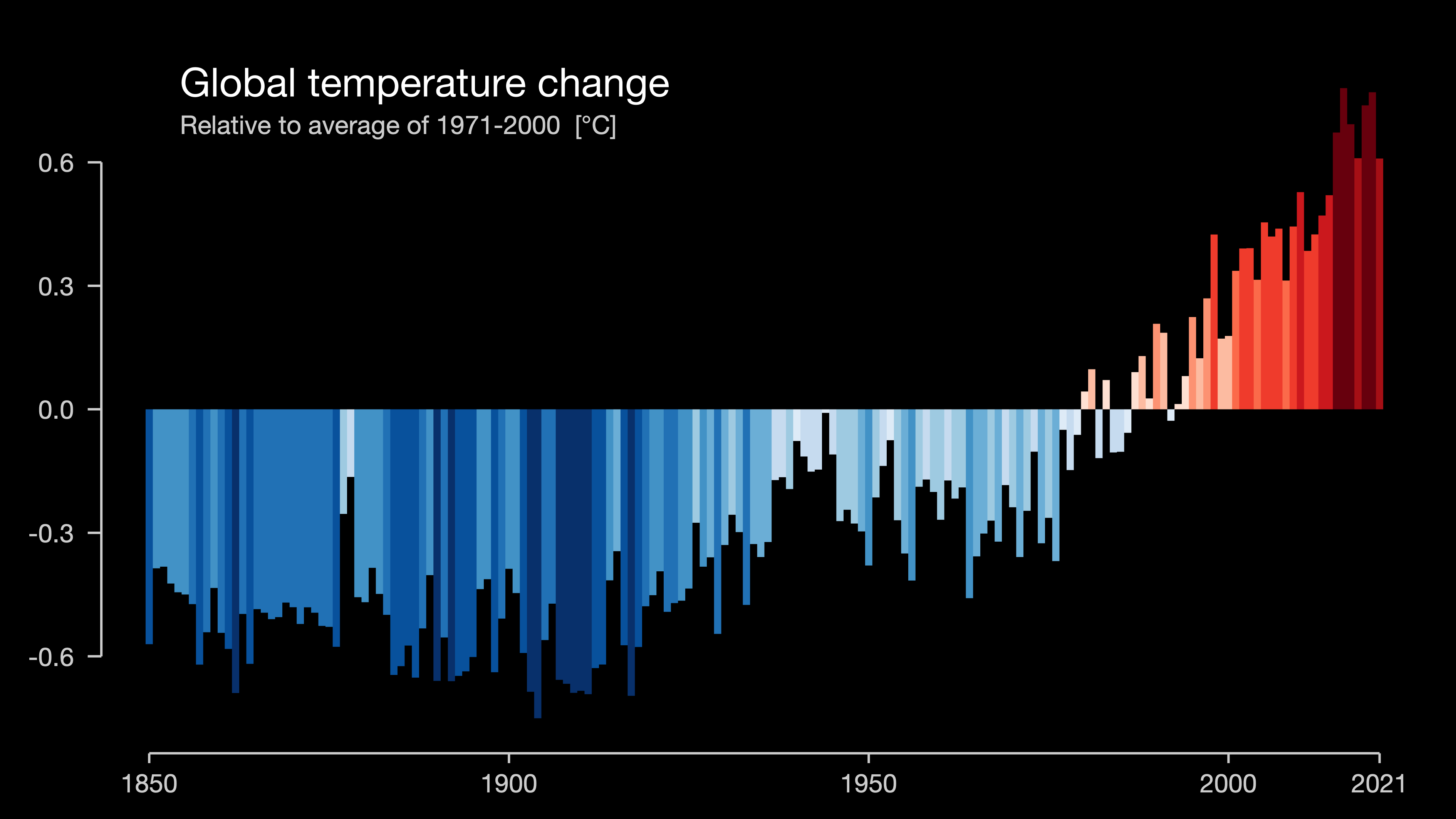
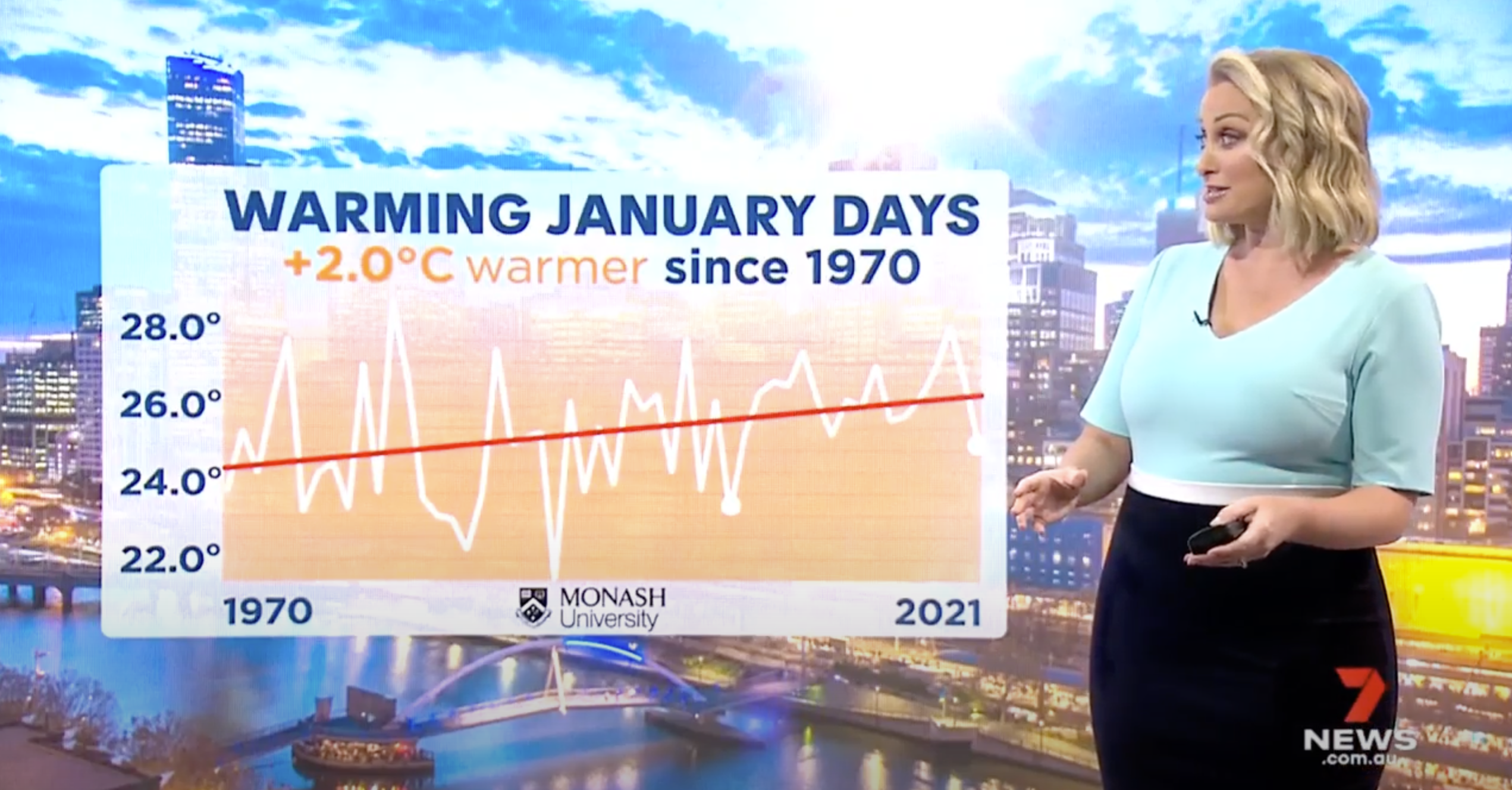
"Interpretation of graphical representations requires a relatively advanced skill set, and may therefore serve to distance some potential audiences.

“Furthermore, [charts and graphs] lack the perceived realism of photographic images, potentially rendering them less memorable and less likely to be perceived as “truth.”

Rebich-Hespanha (2014), investigating the use of visuals in the media

But charts can break through

Climate Stripes by Ed Hawkins

Climate Stripes by Ed Hawkins (showyourstripes.info)

Climate stripes in their original form

Climate stripes with X axis labels

Climate stripes as a barchart

Climate stripes as a labelled barchart

As researchers, you have the opportunity to build social consensus for a policy action, for change or to just help people understand

(It’ll help you talk to your colleagues, too!)

Prime considerations

Who’s your audience?

The public?

Audience at a university event?

Funders?

Peers/colleagues?

What kind of training do they have?

What are they interested in?

How much time do they have?

What’s your purpose?

Helping people evaluate a policy?

Changing individual behaviours?

Convincing your colleagues to change their analyses?

Convincing funders to 💰?

Advising people in an an emergency?*

* do not do this without specific training!

What’s the point?

Point ≠ purpose: it’s the point for the reader

Avoid a “so what?” moment

What does that mean for a visual?

Jane Bunn presenting climate change messaging on 7news

  • Audience: the public?
  • Audience: evening news audience
  • Time: about 7 seconds
  • Our purpose: present evidence of climate change
  • Our point: summer days warming up near you

What does that mean for a visual?

Jane Bunn presenting climate change messaging on 7news

Primary messages

  • Trend line up
  • Getting warmer

Secondary messages

  • Year-to-year variability
  • Length of data record

Screenshot of an ABC news story about climate change projections

Display time:

7-10 seconds

Screenshot of an ABC Story Lab article about climate change

Reading time:

11 minutes (excluding graphics)

Jargon in climate stories

Relating climate to weather

Jargon

daily maxima

maximum daily maximum

area-averaged temperature

(Possible) alternative

daytime temperatures

hottest day

temperature across Australia

Trickier jargon

eg. extreme rainfall

Num. days ≥ fixed threshold

Num. days ≥ historical quantile

% total rain falling on those days

Rainiest 3-day stretch

Rainiest 5-day stretch

etc.

Conclusions

Your expertise is trusted

Think about audience, purpose and point

Reduce jargon…
but keep your aims in mind

Thanks for listening!

Questions?

360info_global

360info.org

github.com/360-info